Redesigning Host-Guest Messaging for Faster Responses
Background
Your.Rentals is a SaaS platform for short-term rental property managers. Hosts use messaging daily to handle guest inquiries, confirm bookings, and coordinate stay details.
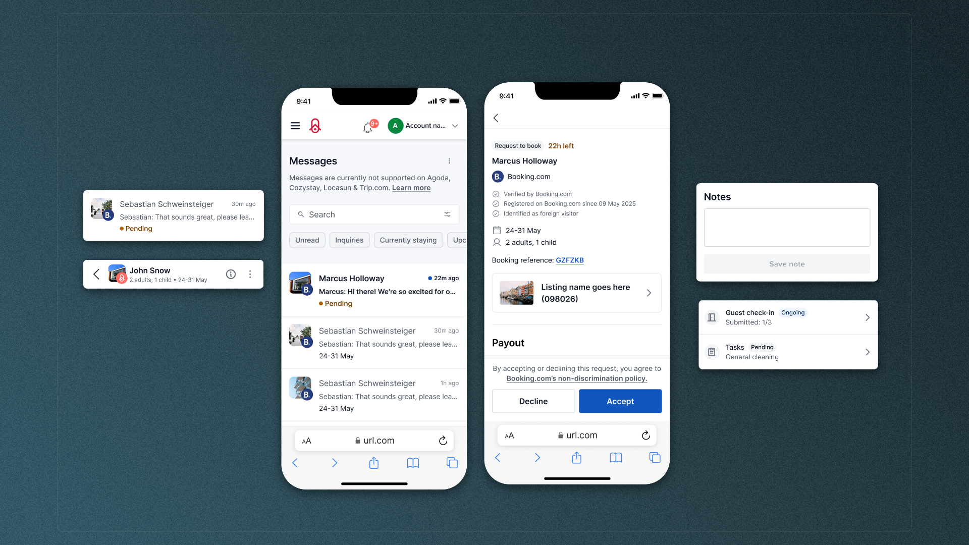
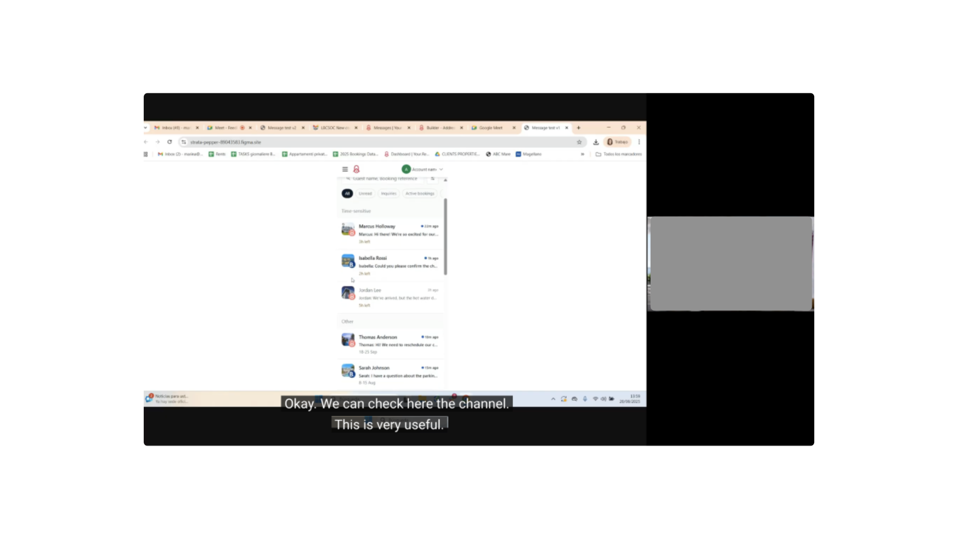
Messaging felt disjointed and hard to manage at speed. The inbox view and the conversation view lived on separate pages, so opening a message took over the screen and removed the overview. Unread status and prioritization cues were easy to miss, which increased the risk of missed inquiries and slower replies.
Research
Johanna drove discovery using multiple inputs: a survey (50+ responses), interviews with power users, and behavioral signals (e.g., heatmaps). Concepts were validated early and repeatedly using AI-enabled interactive prototypes to speed up feedback loops and test logic that static prototypes struggle with (e.g., multi-filter behavior).
Solution
Opening a message replaced the inbox view and removed context, making prioritization harder.
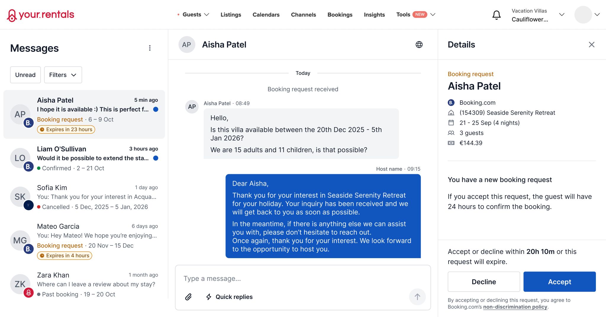
A three-pane layout kept the message list visible while showing the conversation and booking or inquiry details side-by-side.
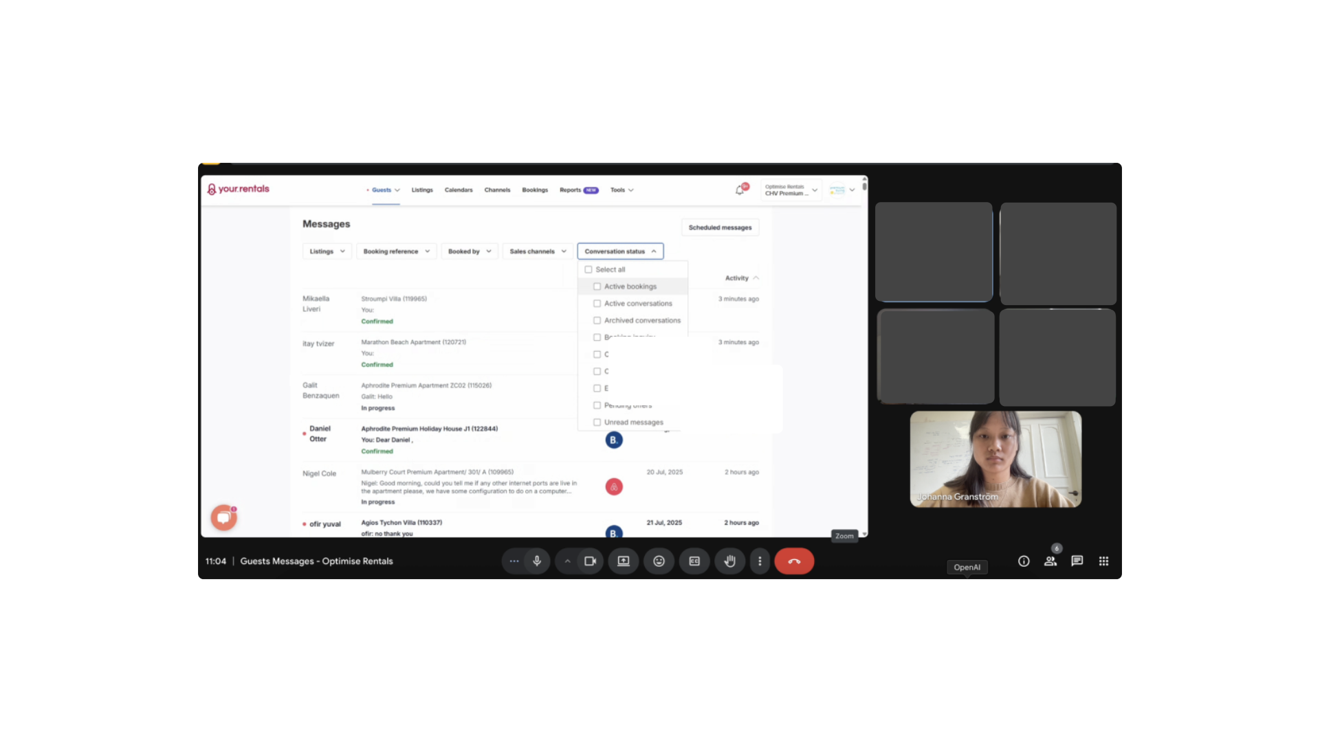
Filtering required multiple clicks across separate filter controls, slowing down daily triage.
Quick filters surfaced the most common views immediately (e.g., unread, inquiries, upcoming check-ins).
Message origin was harder to scan quickly in a mixed-channel inbox.
Channel logos were added to list items so hosts could identify sources faster.
Key actions were buried or hidden behind menus, making them hard to discover in context.
Primary actions surfaced based on context while secondary actions stayed available but less prominent.
System messages looked like regular chat bubbles, which created ambiguity.
System messages used a distinct visual style so it was obvious what came from the platform versus the guest.
Key actions required leaving messaging and navigating to other product areas.
Contextual shortcuts connected messaging to related workflows (e.g., booking notes, resend check-in instructions, view availability, tasks, guest check-in).
Results
• Usability testing with power users indicated faster overview and clearer next actions • Introduced AI prototyping as a team practice for testing interactive logic earlier
• Start with lower-fidelity wires to align engineering before moving into detailed UI • Brief internal teams more explicitly before customer interviews to improve participant preparation and stakeholder confidence
Head of Product
@Your.Rentals
“The team had the absolute pleasure of having Johanna join to cover for a parental leave. She immediately made herself comfortable with the team tasks and started to contribute to the product. Her great design skills in combination of being practical and humble made the implementations fast and simple. Thanks to Johanna's pro-active communication and engagement in UX/UI she made sure no questions remained unanswered. Being such a down to earth professional made Johanna fit in with the team culture from the start. Any company who gets the opportunity to work with Johanna should consider themselves lucky.”
Redesigning Host-Guest Messaging for Faster Responses
Background
Your.Rentals is a SaaS platform for short-term rental property managers. Hosts use messaging daily to handle guest inquiries, confirm bookings, and coordinate stay details.
Data showed excessive back-and-forth navigation, signaling hosts struggled to manage messages at speed
Messaging felt disjointed and hard to manage at speed. The inbox view and the conversation view lived on separate pages, so opening a message took over the screen and removed the overview. Unread status and prioritization cues were easy to miss, which increased the risk of missed inquiries and slower replies.
Research
Johanna drove discovery using multiple inputs: a survey (50+ responses), interviews with power users, and behavioral signals (e.g., heatmaps). Concepts were validated early and repeatedly using AI-enabled interactive prototypes to speed up feedback loops and test logic that static prototypes struggle with (e.g., multi-filter behavior).
Solution
Opening a message replaced the inbox view and removed context, making prioritization harder.
A three-pane layout kept the message list visible while showing the conversation and booking or inquiry details side-by-side.

Filtering required multiple clicks across separate filter controls, slowing down daily triage.
Quick filters surfaced the most common views immediately (e.g., unread, inquiries, upcoming check-ins).
Message origin was harder to scan quickly in a mixed-channel inbox.
Channel logos were added to list items so hosts could identify sources faster.

Key actions were buried or hidden behind menus, making them hard to discover in context.
Primary actions surfaced based on context while secondary actions stayed available but less prominent.
System messages looked like regular chat bubbles, which created ambiguity.
System messages used a distinct visual style so it was obvious what came from the platform versus the guest.

Key actions required leaving messaging and navigating to other product areas.
Contextual shortcuts connected messaging to related workflows (e.g., booking notes, resend check-in instructions, view availability, tasks, guest check-in).
Results
• Usability testing with power users indicated faster overview and clearer next actions • Introduced AI prototyping as a team practice for testing interactive logic earlier
• Start with lower-fidelity wires to align engineering before moving into detailed UI • Brief internal teams more explicitly before customer interviews to improve participant preparation and stakeholder confidence
Head of Product
@Your.Rentals
“The team had the absolute pleasure of having Johanna join to cover for a parental leave. She immediately made herself comfortable with the team tasks and started to contribute to the product. Her great design skills in combination of being practical and humble made the implementations fast and simple. Thanks to Johanna's pro-active communication and engagement in UX/UI she made sure no questions remained unanswered. Being such a down to earth professional made Johanna fit in with the team culture from the start. Any company who gets the opportunity to work with Johanna should consider themselves lucky.”